Cape of Storms, second edition has a new cover!
Dear Readers,
The second edition of my first novel, Cape of Storms, is out now. Among the changes, it has a new cover and I have replaced the Author Q&A, at the back of the book, with a Letter and Book Club Questions.
First, let’s talk about the cover
As you may or may not know, I design all of my book covers. Much like my publishing journey, my knowledge and experience regarding book cover design started at zero and it is something that I have slowly but surely taught myself over the past 8 years, through a series of trial and error.
Cape of Storms Cover
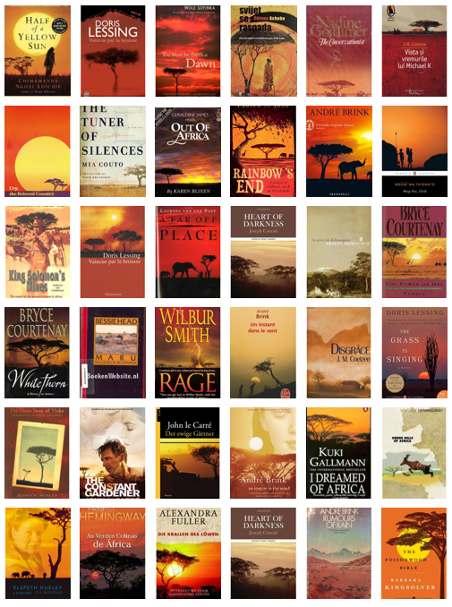
So, when I first started researching and thinking about the cover design for CAPE OF STORMS, my research quickly led me to a number of articles about how Big Publishers had historically used the same ‘treatment’–acacia tree, setting sun, orange colour scheme–for every book set in Africa. And, in so doing, these ubiquitous covers had established a sort of visual shorthand for readers. A shorthand that helped them instantly identify a novel set in Africa. The image collage below is taken from an article in The Atlantic, which you can read HERE.
The CAPE OF STORMS cover quandary…
When I discovered these covers, I knew that I didn’t want to give my cover the “colonial book cover treatment”, and so I tried to think of another way to communicate the book’s wider themes and messages in terms of the cover I designed. After several different concept designs, I eventually went with this one:
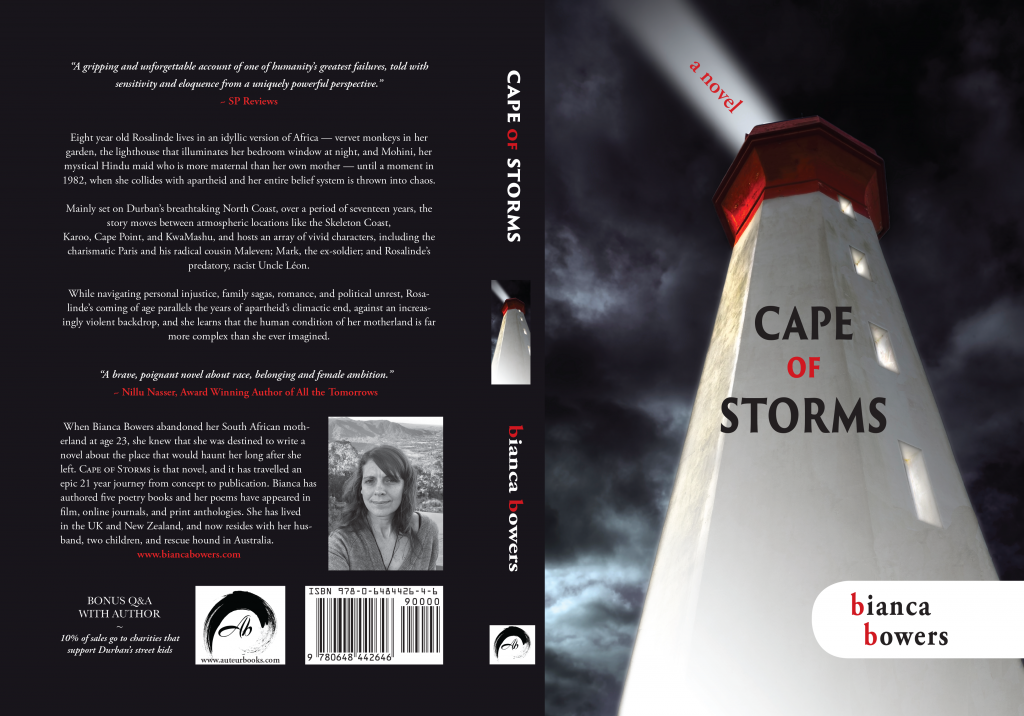
The lighthouse concept worked in two ways: it complemented the title–Cape of Storms–and it spoke to the overarching theme of the novel–a dark, stormy and volatile world.
So, why the change?
While I wanted to design a cover that bucked the old trend of acacia trees, setting sun, and orange colour scheme, I ultimately could not get away from the fact that this visual shorthand is well-established in the mind of the reader. In short, the lighthouse cover was not communicating “Africa” to its intended audience, and so I had to rectify that.
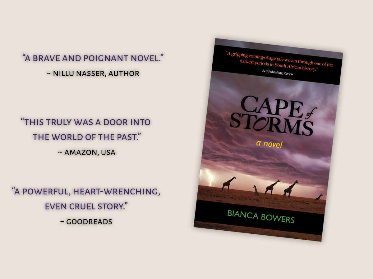
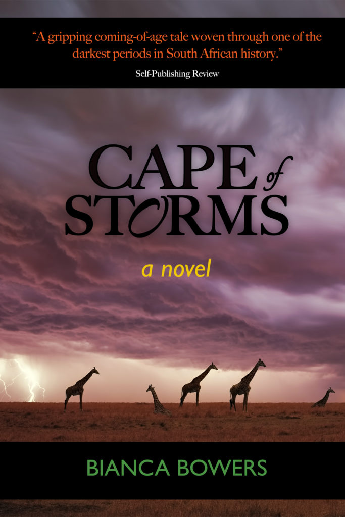
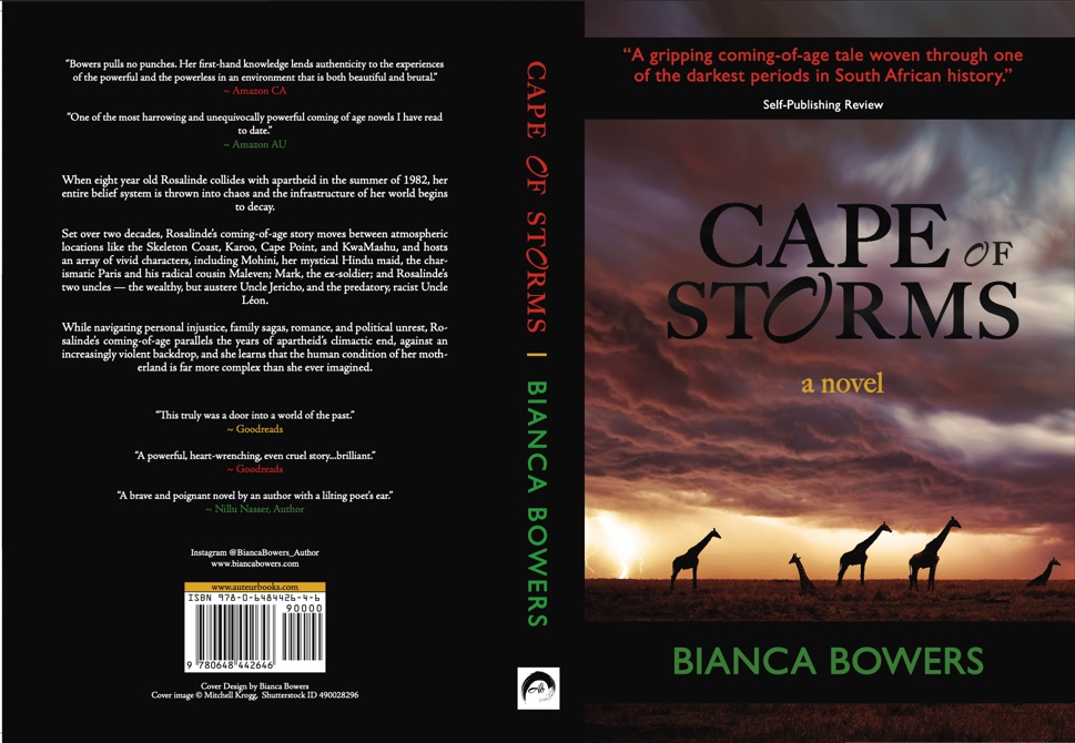
The new cover for Cape of Storms
I needed an image that would instantly convey “Africa”, but I also wanted to avoid the cliched acacia tree. After searching a combination of keywords on Shutterstock and trialling several different images and concepts, I eventually found this striking image by Durban-based photographer, Mitchell Krog, on Shutterstock and knew that it was “the one”.

New Cover Design for Cape of Storms, Second Edition
With a bit of help from a client who is great with topography and colour, I tried several different Photoshop effects before settling on the font and other elements. Then I asked people to give me feedback and left the cover alone for a few months before I decided to go ahead with it. Et Voila…
A reader’s feedback
I find the whole subject and history of book cover design fascinating, and I’d love to hear your feedback about the Cape of Storms book cover. Did you know about the “African book cover treatment”? Have you inadvertently been making these connections with books set in Africa? Which cover do you prefer? Let me know in the comments. I’d love to hear your thoughts and feedback.
Buy your copy
Cape of Storms is available globally via any online retailer, but the updated copy might take a while to trickle through. As always, Amazon is ahead of the game, and the new cover is available now. Get your copy now via the links below!
Books2Read AMAZON
Next time, I’ll be sharing the letter, dated 2019, that has now replaced the Author Q&A at the back of Cape of Storms.
Until then,
Bianca xo
RESOURCES
Why Every Book About Africa Has the Same Cover: The “post-colonialist and Orientalist” undertones of the ubiquitous acacia tree
Book cover clichés: have you spotted recurrent designs?
biancabowers
Bianca Bowers is an award-winning author and best-selling poet who is based in Australia. She holds a BA with double majors in English and Film/TV/Media Studies, and has authored eight books through her imprints Paperfields Press and Auteur Books: six poetry collections and two novels. Her work is inspired and informed by life, love, personal evolution, and the human condition. www.biancabowers.com


2 Comments
Kent Watkins
Bianca, your first cover was the best idea, even though it is also is a trope for friends who lodge near there and always take a picture with it in the background, as they do when skiing at the Matterhorn. You bravely took headon the cliche of the pan-Africa book cover by posting the two articles that we all agreed with, at least this reader and many others. We hoped that the articles would serve as a red light to future authors, but instead you repeated it. And to remove the Q&A, another loss. Well, I keep my earlier edition so the cover depicts more the story and the title. Hopefully, it will return in a future edition, without the loss of a new ISBN. I recently was at the South African Embassy in Washington, D.C. to attend a reception with the Ambassador, Nomaindiya Cathleen Mfeketo, and showed her a copy of your first edition. You might also like to know about an anti-apartheid history exhibit that is being shown in Joburg now and at the Kennedy Center in D.C. this summer. Professor jean.bailey@howard.edu is coordinating it through AVAA, https://americasvoicesagainstapartheid.com/. I think you would approve. Thanks for adding your important voice to this Conversation and success in your new endeavors. Kent Watkins, Washington, D.C.
biancabowers
Hi Kent, thank you for your thoughtful and honest feedback. I do appreciate you taking the time and effort to look me up and let me know. Being an independent author and publisher oftentimes means that I write in relative obscurity, and I can only gauge the failure or success of a book by sales, reviews and reader feedback in the way of emails or comments like this one. Since its publication in 2019, I have viewed Cape of Storms as a personal success, because I wrote the book I wanted to write. But I have viewed it as a commercial failure, because sales have been minimal to non-existent. Hence, the reason I decided to revisit the cover and emphasise the book’s African setting in order to catch the eye of the right readers. Since changing the cover, I have still not seen sales, but I have received a consistent stream of feedback from readers via personal emails – everything from telling me how much the books has impacted them to asking permission to cite quotes in university theses and work presentations. Of course, whether this is to do with the book cover or simply the book making its rounds over the years, I can’t say for sure.
I do, however, take your comments seriously. The beauty about being an independent author and publisher is that I can publish another version with the old cover and reinstate the Q&A if I wish. In fact, I am discovering, as I move further along this author/publisher journey, that I will most likely publish future books with 2 different covers – the more artistic cover, that appeals to me, and the commercial cover that attracts readers of that genre. For it is not just African-themed books that the traditional publishing industry have given “the same book-cover-treatment” to; they have consistently done it across all other genres, essentially turning the majority of readers into Pavlov’s dogs by creating visual cues that the reader either responds to or doesn’t.
Thank you again for taking an interest in Cape of Storms by reaching out to me and by sharing it with people like the Ambassador Mfeketo. I am deeply appreciative. Kind regards, Bianca.